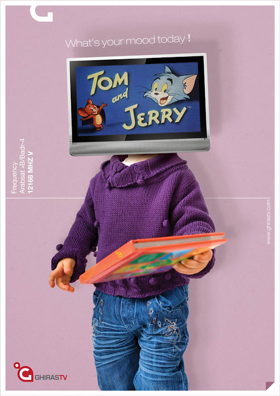
Art Director: Saif El Degwi
Photographer: Yuri Arcurs
Via: MediaME.com
Oh dear oh dear oh dear…
I was actually trying to like this stuff, although I agree wholeheartedly with a post on Ads of the World bitching this campaign out, on the grounds that the whole head-substitution thing is really overdone. I thought we were getting into the limb-substitution phase for the next decade or so, but apparently Kuwait’s still a bit behind the times (hands to the air if you’re surprised… anyone?).
So yeah that’s a negative point right from the git-go, but the first one of these that I saw was the Barcelona one, and I was thinking, “That’s alright, the dress code goes with the subject, okay,” so I figured I’d see what the others have in store for me. Next thing was the Spiderman one, it was a bit wierd cause I never thought of Spiderman being in a High School Musical movie till now, but still alright. Then… the guy ‘watching’ ‘Saving Private Ryan’ is just wearing a T-shirt and jeans. And the broad watching ‘Casablanca’ is wearing some crappy top that underlines the difference between ‘classic’ and ‘bloody old’.
Come on people! I understand you gotta roll with some crappy ideas every now and then, but at least go all the way with them! He’s watching ‘Ryan’, put some camo slacks on him! She’s watching ‘Casablanca’ (and judging from that top, she’s probably blowing the twerp she’s sitting with who actually is watching) then make the ad mono-bloody-chromatic! Something to make a connection, anything! These look like you got lazy halfway through and got the caterers to just stand in front of the camera so you could get back to whatever drab hobbies you got.
“What’s your mood today,” 2allak. It was actually quite nice until I saw this junk. Thanks a whole damn lot.


