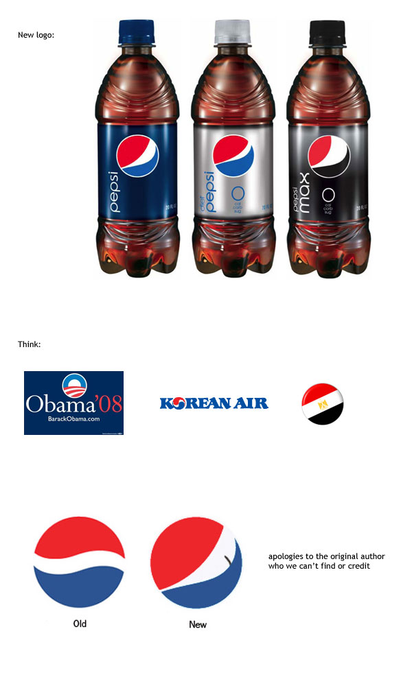
Apparently, Pepsi has re-branded. The re-brand will probably take a good 6 months to a year to reach Cairo, giving us all enough time to (tear it apart) talk about it.
Rewind to last summer in Egypt, Sprite campaign showcasing their new logo, compliments of Memac Ogilvy. The headline reads “Ana Kida, ana Sprite” which off course translates to ‘I’m like this; I’m a fucking annoying ass (Sprite)”. Sprite spent loads and loads of money on this campaign. They were everywhere in Egypt, and it sucked big-time.
Please please Pepsi (Impact BBDO), don’t do a Sprite on us.
Anyway, here’s what Pepsi had to say about their new logo(s):
The Diet Pepsi logo has a ‘slight grin’, Pepsi’s a ‘full smile’, while that for Pepsi Max expresses laughter. The font accompanying the logo will shift from a bold upper-case to a retro lower-case format, with the ‘e’ mimicking the white curve of the classic logo.
Why 3 logos? Smile, grin, laugh. Why not add buck teeth, braces, and an asscrack while you’re at it. What about the other Pepsi sub-products? And then there’s the laughing Egyptian PepsiMax. Mashi, di momkin 2a3adeeha fi sabeel masr we beta3.
Frankly, i’m just not feeling it. I’m not smiley. yet..

